With the holiday shopping season upon us and a global supply chain crunch dominating the headlines, it’s worth reflecting on the miracle of logistics that occurs between a product’s manufacture and its arrival to final destination. Each and every day, billions of dollars of inventory move around the world and into the hands of consumers. In between, the product is likely stored in one or many distribution centers (DCs). DCs vary in complexity, but range in size to upwards of 1 million square feet, with thousands of distinct products inside, and miles of conveyor belts. The modern-day warehouse management team is responsible for keeping these buildings running smoothly and to do this, they must sift through mountains of generated data to minimize handling of inventory while maximizing throughput.

Slotting
One of the key strategies to accomplish this is slotting, the process of optimizing the layout of inventory in a DC based on factors like size, format, storage medium, seasonal velocity, and affinity with other products. For large DCs, the variety and complexity of inputs and outputs for slotting algorithms can be vast.
Once a warehouse inventory manager decides on a slotting strategy and implements it, the difficult next task is measuring the effectiveness of the implemented strategy. Historically, this has involved linking multiple inventory- and velocity- related data pulls into spreadsheets, and then digging through this data via formulas to understand if a product is slotted correctly according to historical velocity. With thousands of SKU numbers and locations, this can be extremely cumbersome.
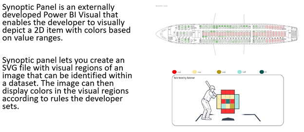
Synoptic Panel for Power BI
The Synoptic Panel custom application in Power BI presents a useful alternative.
Slotting Strategy using Synoptic Panel
This video from Synoptic Panel’s website shows a small-scale example of visualizing a warehouse.
However, this technology can also be deployed at a large scale. This map was custom built to display the locations and aisles within a bustling medical device warehouse. When a user hovers over a location, they can see the location, part number, and number of units picked within the set time period for that location. They can then drill into that location to see when inventory was deposited there, as well as the extended pick history.
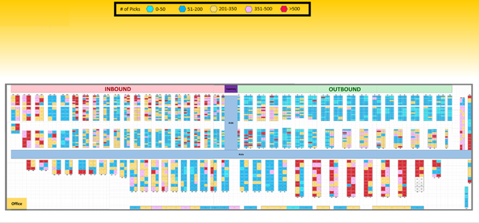
Looking at the above map, it’s easy to see this warehouse is not efficiently slotted. Pickers have to travel to the furthest corners of the building most often to pick product, before dropping it off over at the outbound dock. This leads to unnecessary travel and unproductive walking for employees.
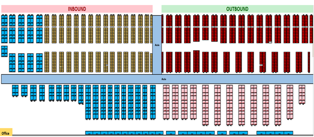
An ideal slotting strategy for this building looks more like the below heatmap, with the fast-moving product slotted closer to the outbound dock, and the slow-moving product slotted furthest away from the outbound dock:
Use Cases
There are many other logistics-related use cases that can leverage the Synoptic Panel visualization in Power BI. This includes, but is not limited to:
- Finding locations that contain specific part numbers across the building
- Teaching new employees the naming scheme of aisles in the building at orientation
- Integrating Labor Management System (LMS) data to analyze an employee’s travel throughout the day and explain time lost between picks
- Yard and trailer management
Whatever slotting strategy you decide on, it can be paired with a custom map of your warehouse with Synoptic Panel in Power BI to better understand the movement of inventory within the 4 walls and drive continuous improvement and efficiency within your Supply Chain.
Contact 3Cloud
Our team of BI experts can help you learn more about Power BI and how to use it effectively to optimize your supply chain. Contact us today or attend a free event!