Visual personalization has arrived in Power BI, and it is a significant feature that expands viewers’ data exploration capabilities.
For users accustomed to pivot tables and charts in Excel, Power BI now has a similar experience for rapid visual exploration built-in. Users do not need to have access to edit the report or have Power BI Desktop installed to take advantage of this feature either. Personalization is available in the Power BI Service for any end user once enabled for a report.
How To Personalize Visuals
3Cloud guides you through the basics of personalizing visuals in this video:
Does Personalization Work with Custom Visuals?
Users do not have the ability to add new custom visuals, but any custom visual that the report author has imported into the report is available when personalizing. It does not matter whether the visual is actively used on the report or not. This means that users can extend their exploration well beyond Power BI’s core visuals.
Can We Format Personalized Visuals?
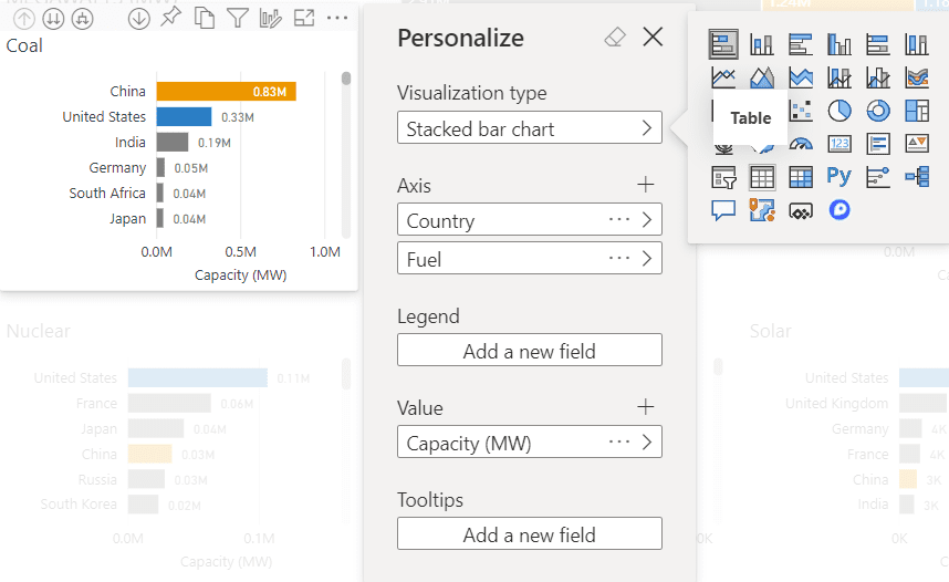
Visual personalization currently only allows users to change the visualization type and the data in a chart. Basic formatting such as changing colors or adjusting axis options are not available. Even the visual size cannot be changed, so either start by personalizing a larger visual or get used to expanding out to Focus Mode to explore the data.
How Can Viewers Save Personalized Visuals if They Cannot Edit and Save Reports?
The easiest way to save visuals is to use Personal Bookmarks. Once a user modifies a visual, save that view as a personal bookmark in the Power BI Service. Personalized visuals will not persist if a viewer simply closes and re-opens a report. They will appear when a personal bookmark is saved as part of their personalization effort though.
Can Viewers Share their Personalized Visuals?
Once a user personalizes a visual, they can pin the visual to a dashboard in the Power BI Service. From there, it is available for anyone with access to that dashboard.
What About Excel Pivot Tables and Pivot Charts? Does this Replace Excel Data Visualization?
Personalizing visuals in Power BI is a native substitute and extension of how many people use basic pivot tables in Excel. It is a powerful alternative in scenarios where users employ Analyze in Excel or export their data to Excel and only want to explore data in a pivot table.
It is doubtful that visual personalization will overtake Excel pivot tables anytime soon. This feature–while a powerful exploratory tool–will not replace outside analysis and customized Excel reporting altogether. As more users are educated and aware of personalization and its potential, however, it may replace some reliance on Excel for basic pivot scenarios.
What Is the Impact of Hiding Implicit Measures in Data Models?
An accepted practice in Analysis Services and Power BI data modeling is to create basic explicit measures with a default aggregation and hide the underlying implicit measure. An explicit measure uses DAX. One common reason to hide implicit measures is that they do not work as expected in Excel pivot tables. Although a field may be numeric, Excel does not recognize the implicit measure as such and does not allow it to be added as a value to aggregate. Explicit measures are required in this scenario.
With explicit measures, users cannot override the selected aggregation when personalizing visuals. For example, a typical explicit measure is a basic sum of a numeric field. If an end user who is not the data modeler wants to view the average of that field instead of the sum, they would either need to request that a new explicit measure be created for them in the data model or ask that the underlying implicit measure be made visible.
From an exploratory perspective, implicit measures combined with Power BI’s visual personalization are far more powerful in the personalization scenario than explicit measures that only consist of a predefined aggregation. With a single implicit measure, users who may not have access to change the underlying data model can still explore variations in the data without having to request and wait for an update to the dataset that includes another explicit measure for them. Implicit measures allow users to easily see variations of a numeric field such as sum, average, minimum, maximum and more—now bundled into a convenient user experience with personalization. End users themselves can dynamically change the default aggregation and explore and pin different views with that measure.
In the case of personalized visuals now native to Power BI, however, the common practice of hiding implicit measures prohibits the feature from reaching its full potential.
One advantage of visual personalization is to put powerful exploratory ability into the hands of end users without having to rely on upfront changes to the data model. Handicapping Power BI for the convenience of external tools like Excel or to reduce perceived clutter in the model is not advantageous for this new native feature but will of course continue.
Get Started with Personalization
Personalization is available at the report level. Once enabled, you can personalize any visual in the report and pin the result to a dashboard.
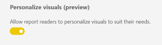
Enable personalization in Power BI Desktop in Options / Preview Features for now.
Alternatively, enable it in Power BI Service in the report Settings area.
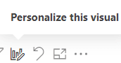
Once this option is available, hover over a visual and select the Personalize this Visual icon to get started.