Right now it seems like time is accelerating while data is trailing behind. If you are like me, then you have been voraciously reading the news and latching on to any new information that comes out. But uncertainty still looms large.
As a Data Scientist and an Economist, I am accustomed to big data sources that are high-volume, high-variety, and/or high-velocity. Now the problem has reversed. Reliable economic indicators are few and far between while individuals, organizations, companies, and governments are all trying to understand how their own local economy is affected. In this data drought, I will show how BlueGranite uses Power BI to leverage historical employment data with early indicators to measure county-by-county unemployment risk.
How High Can Unemployment Go?
Put bluntly, the economy is not doing well amid the COVID-19 pandemic. Companies are reducing hours, furloughing, or outright laying off workers. Social distancing is changing both the ability of people to work as well as demand for goods and services. Economists at the University of Chicago recently estimated that 63% of jobs in the US (representing 56% of wages) cannot be performed from home [1].
However not all of those 63% of jobs are at risk. But how many are? Who and where are the most affected? And by when can we know? Since the lag in official government data is long, I will consider the first two questions using already available information.
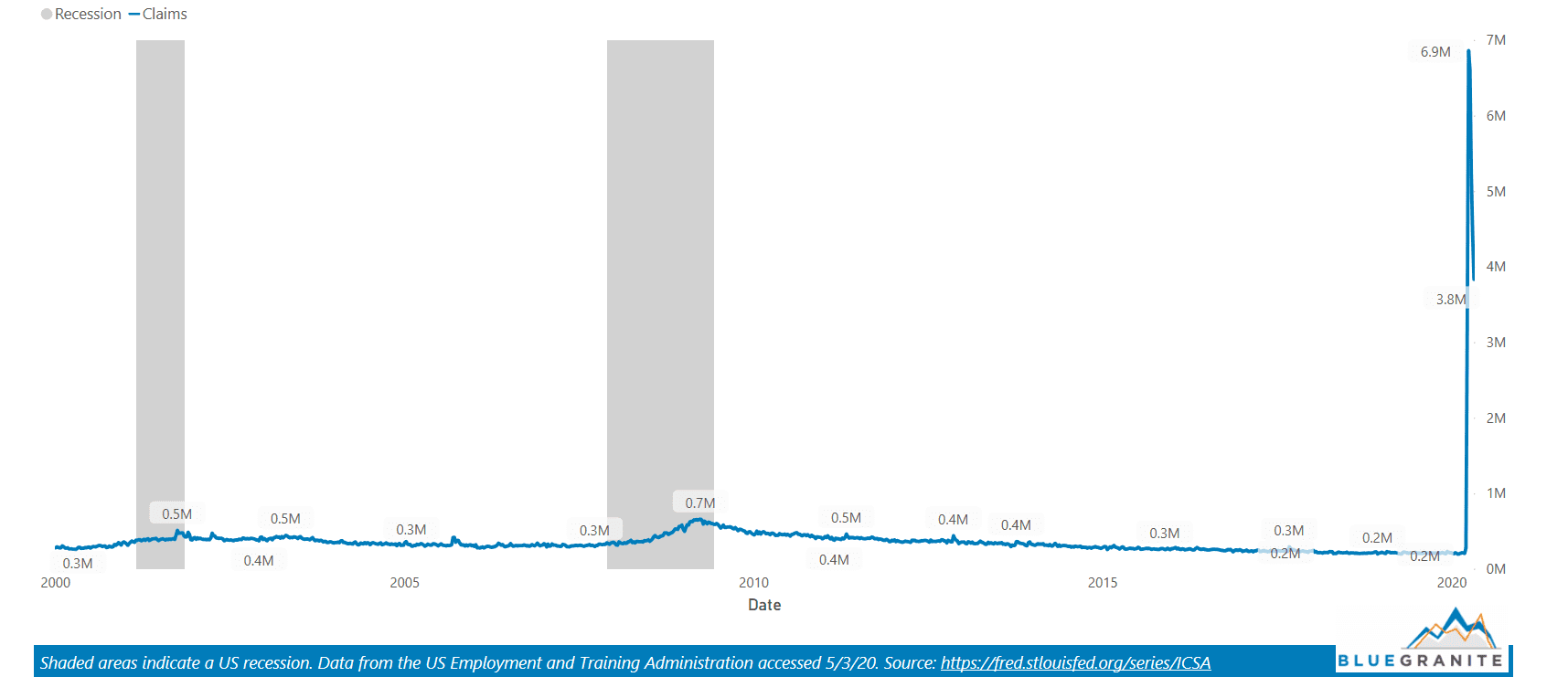
One early indicator on the health of the labor market is the initial unemployment claims from the US Employment and Training Administration. This reports on a weekly basis the number of employees recently laid off who applied for unemployment benefits. It is an imperfect measure since it excludes many groups, such as those with informal jobs, gig workers, the self-employed, and those who choose not to apply or simply do not know they are eligible. (Note: This list varies by state and the recent CARES Act passed by Congress has changed some requirements.) Regardless, the surge in unemployment claims beginning mid-March is both intimidating and unprecedented.
Initial Unemployment Claims (weekly)
 click here for live report
Despite the aforementioned caveats, there were over 30.3 million applications for unemployment benefits submitted in the six-week spike shown above. Evaluating this with the 205.6 million working-age population in the US means that approximately 14.7% of working-age adults have applied for unemployment benefits [2]. This is a staggering number when compared to the unemployment rate that peaked at 10% during the Great Recession and 25% during the Great Depression.
On May 8th the Bureau of Labor Statistics confirmed that April unemployment did in fact reach 14.7% [3]. A glass-half-empty person will note that unemployment may get worse next month, but a glass-half-full person will point out that this hopefully a short-term low point before the economy bounces back. Regardless, we should expect higher unemployment to persist throughout the year since business economists forecast the unemployment rate in Q4 of 2020 to still be around 9.5% [4].
The Industry Most Affected
These are unprecedented times and organizations need better data in order to make decisions. Instead of waiting months for granular data to be made available, we can instead estimate the population that is at risk of becoming unemployed. The sector most affected, Leisure and Hospitality, makes up a sizable share of the US workforce.
Employment by Sector
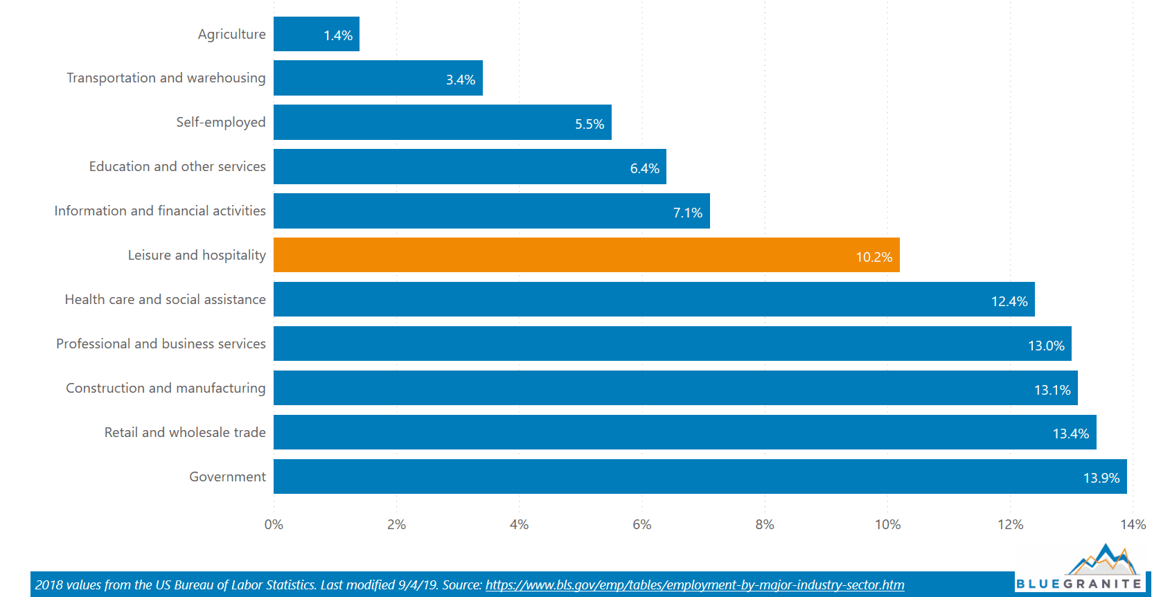
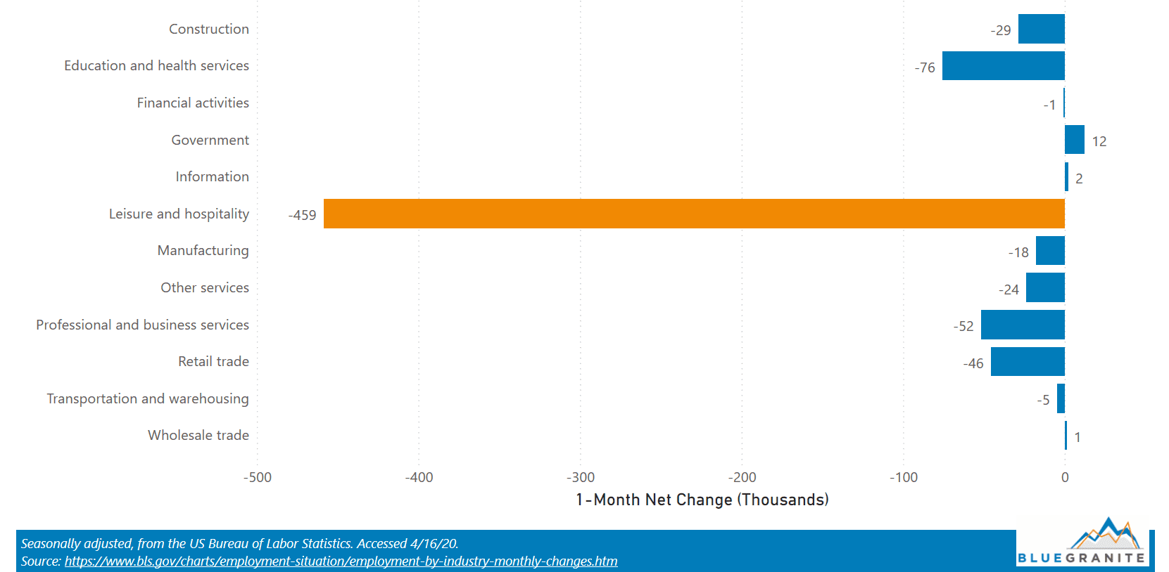
This single sector of course does not represent all jobs at risk – far from it. Instead it represents the most salient of industries affected by the pandemic in terms of lost employment. In March 2020 alone, nearly 16.4 million US employees within the Leisure and Hospitality sector lost their jobs followed by an additional 7.7 million losses in April [5].
Change in Employment from Previous Month (March 2020)
Your Local Economy
Although the above numbers are useful, they only represent estimates at the national level. If we can measure the size of this group by county, then we can estimate the share of the workforce within Leisure and Hospitality that is likely to become unemployed. Without recent information available, I use Q2 data from 2019 to build a map in Power BI to visualize county-level data across the entire United States.
The different shades represent a county’s share of Leisure and Hospitality employees relative to the national average. It shows additional county-level information about this sector such as the average weekly wage of a worker, total quarterly wages, total number of establishments, and total number of workers.
County-level Employment Data, Leisure & Hospitality Sector (Q2 2019)
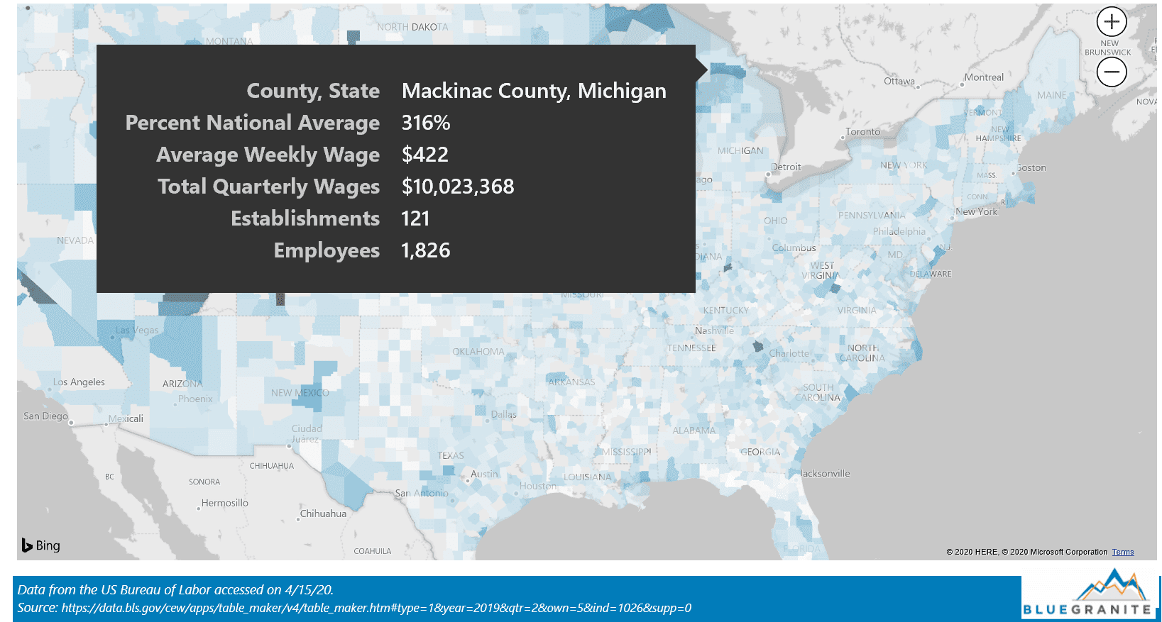
The map provides some clear insights into the geographic distribution of an industry hard-hit by the current pandemic. In my own state of Michigan, I can see the most at-risk counties are Mackinac and Keweenaw with Leisure and Hospitality employment at 316% and 308% of the national average, respectively. This makes sense given that Keweenaw County is known for its outdoor recreation, including the state’s only national park, while Mackinac County includes the highly visited tourist destination of Mackinac Island. This is in sharp contrast to the remote and sparsely populated counties of Baraga and Missaukee in Michigan with a share of employees in the Leisure and Hospitality sector of only 37% and 32% of the national average, respectively.
The Need for Business Intelligence
Visualizations like this can help businesses estimate how affected their nearby customers will be. It can also help local governments anticipate local needs as well as how local unemployment can affect their tax base. As data continues to come in, it is now more important than ever for organizations to use modern business intelligence tools to make sense of these numbers.
| [1] How Many Jobs Can be Done at Home? | https://bfi.uchicago.edu/working-paper/how-many-jobs-can-be-done-at-home/ |
| [2] Working Age Population: Aged 15-64: All Persons for the United States | https://fred.stlouisfed.org/series/LFWA64TTUSM647S |
| [3] Bureau of Labor Statistics Employment Situation Summary (April 2020) | https://www.bls.gov/news.release/pdf/empsit.pdf |
| [4] April 2020 National Association of Business Economists Flash Outlook | https://files.constantcontact.com/668faa28001/765a4afd-4ed3-4ea0-b98b-ae631771042b.pdf |
| [5] Bureau of Labor Statistics Employment by industry, monthly (April 2020) | https://www.bls.gov/charts/employment-situation/employment-by-industry-monthly-changes.htm |