It is important to understand your audience to effectively communicate your ideas and information during a speech or presentation. Building effective and powerful dashboards for an audience (or a group of report consumers) requires an approach similar to giving a speech since dashboards are also a way to communicate data. Knowing this – have you ever taken the time to learn about your audience’s communication styles?

There are countless ways to classify communication styles. To narrow things down, we’ll use part of the Myers-Briggs Type Indicator. The four Type Indicators we will explore for designing dashboards are Sensing, Intuition, Thinking, and Feeling [1]. Here’s a quick overview of how each type of communicator generally consumes a dashboard:
Intuition
Intuitive users are generally looking for the bigger picture. This makes them an ideal group of dashboard consumers as they prefer overviews rather than extensive detailed reports. When presenting data to the Intuitive user, provide the summary levels first and include additional details through click-throughs or expanding actions.
Sensing
In contrast with the Intuitive users, people who are Sensors tend to like to see the complete picture. Instead of presenting at a summary level, try providing basic components that will show a complete context underneath the summary information. This will save Sensor users from clicking down into the details to validate and orient themselves each time they view a dashboard.
Thinking
Another set of the Myers-Briggs Type Indicators are the Thinker and Feeler. Thinkers, commonly known for taking an analytical approach, focus on the data, numbers, and facts. When Thinkers express information, it is in the form of specific data values. If having to choose between displaying the value or an indicator, you would be best to show the specific value. Sometimes, you can spot Thinkers according to their requests for data labels within chart and graph elements.
Feeling
The opposite of the Thinker is the Feeler who has a more personal communication style. Instead of asking “What does the data say?”, feelings resonate more with this type. When designing for this type, use simple indicators to interpret business rules and convey data, rather than overwhelming a dashboard with numbers. When a Feeler sees data labels on charts and graphs, they will typically request the data labels be turned off to declutter and simplify the dashboard.
Communication Style Examples
Let’s compare how these communication styles impact a sample dashboard design using Microsoft Power BI. In this example, we have survey ratings from customers for a chain of restaurants. Each survey is composed of six questions asking the customer to rate their experience on a scale of 1 to 5. To compare the communications styles, we will answer a simple question: “What are the top restaurant locations?”
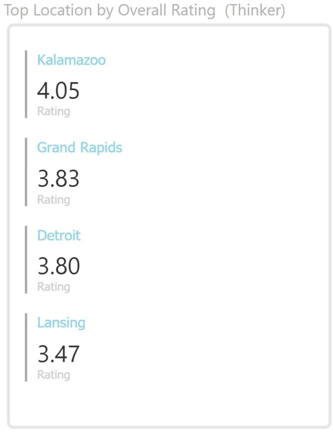
Thinking and Feeling types are easy to contrast as Thinkers want to see the numbers and Feelers want to see an indicator. On the left chart below (Figure 1) you will see the list of restaurant locations sorted by their overall average survey rating. This is okay for a Thinker, but a Feeler will desire a visual indicator as shown on the right chart below (Figure 2). As Figure 2 only shows stars, Thinkers will still be wondering what the exact rating is.
 |
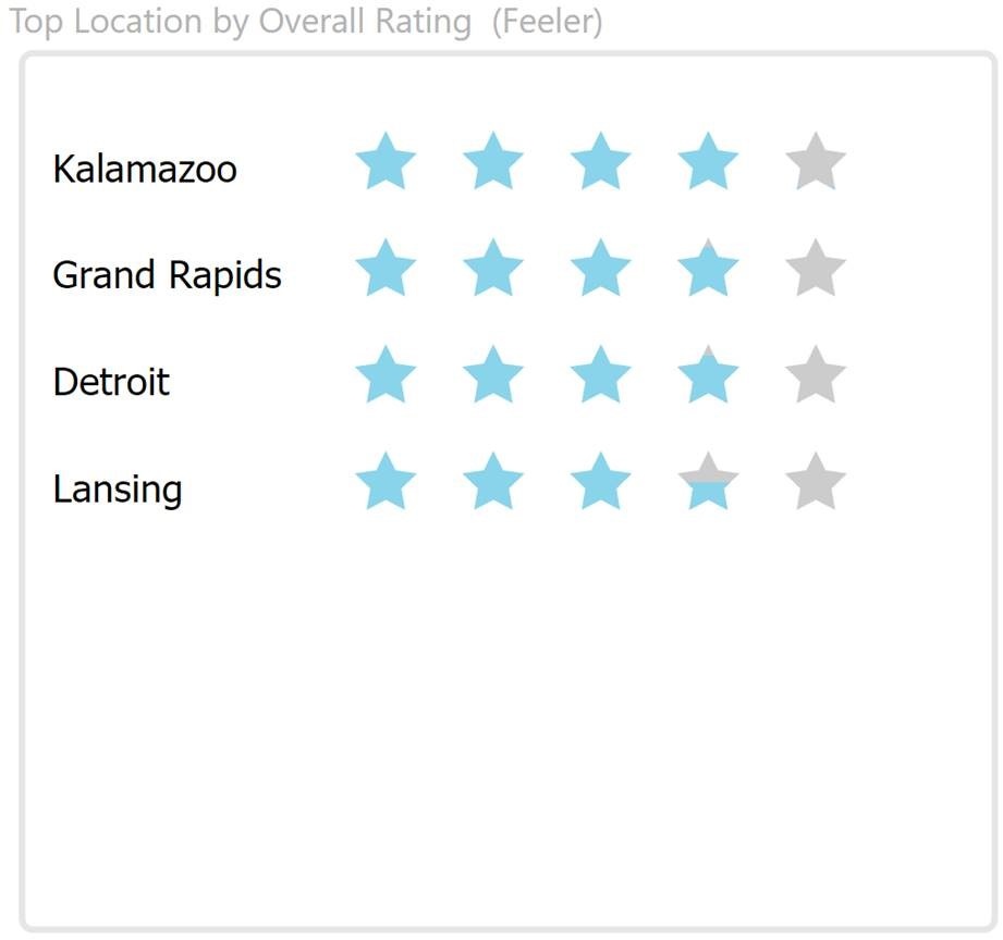 |
| Figure 1 – Thinker | Figure 2 – Feeler |
So what happens when you have an audience that is mixed? One solution is to find a compromise that satisfies both communication styles. In this case, the compromise is to combine the two and show the values alongside the stars as shown below (Figure 3) while not overwhelming the dashboard with a wall of numbers.
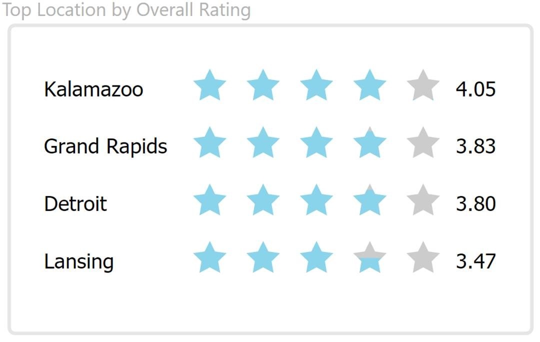 Figure 3 – Thinker / Feeler compromise and Intuitive
Intuition and Sensing types contrast in the level of detail they prefer to see. Here, the overall rating is composed of six different ratings. The Intuitive user will generally be content with the overall rating as shown in Figure 3, above, and will click through to more details on only the locations that are of interest or concern. Sensors will appreciate the chart below (Figure 4) that includes the six ratings that compose the overall rating.
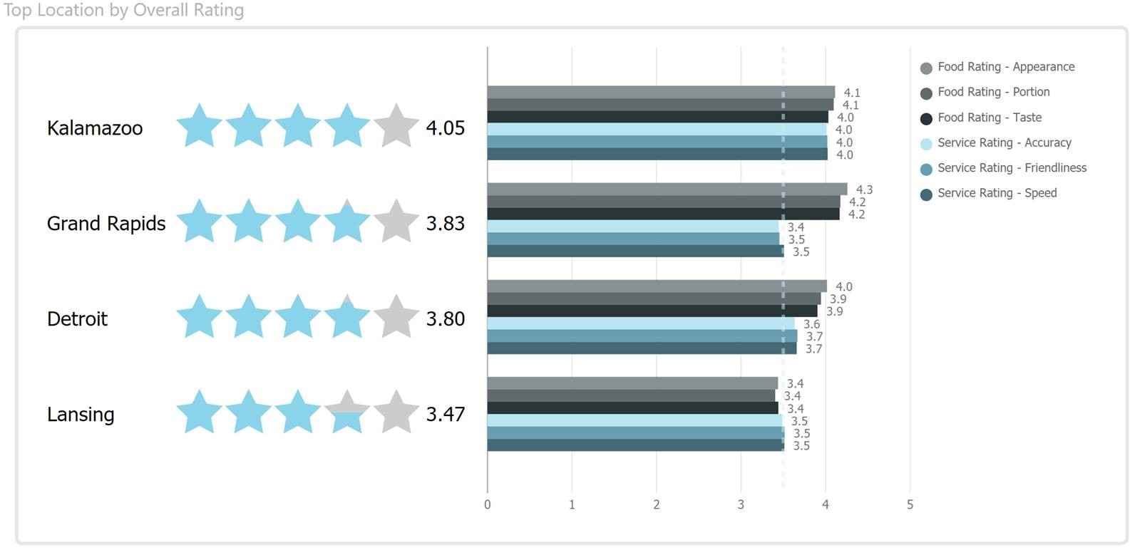 Figure 4 – Sensor
Minding Your Audience in Dashboard Design
You will most likely have a mixed audience outside of a dashboard built for a single user. In these cases, consider narrowing the audience of the dashboard to key individuals, finding an acceptable compromise, or dividing the dashboard into more focused topics that will reduce the mix of audience.
Another area to keep in mind is that these communication styles are a person’s primary tendencies which can relate to the individual strongly or moderately. Individuals may not have a preference between Thinking/Feeling or Sensing/Intuitive. Also, these communication styles are not the only design they can comprehend since they only indicate preferences. These preferences should be considered when it enhances (rather than dilutes) the dashboard to effectively answer a question and prompt action.
Understanding various communication styles enables you to refine your dashboards enhancing their effectiveness. Designing a dashboard will become less about your preferences and more about those of the audience. In addition, when you receive feedback, you can use it as an opportunity to understand why a user is requesting changes to a dashboard you designed in a specific way.
Whether you are looking to develop new dashboards or enhance current ones that are difficult to consume, 3Cloud is here to help. For more information and to learn more about how we can work with you and your organization, contact us!
References:
[1] The Myers & Briggs Foundation. (2014). MTBI Basics. Retrieved December 4, 2017, from http://www.myersbriggs.org/my-mbti-personality-type/mbti-basics/