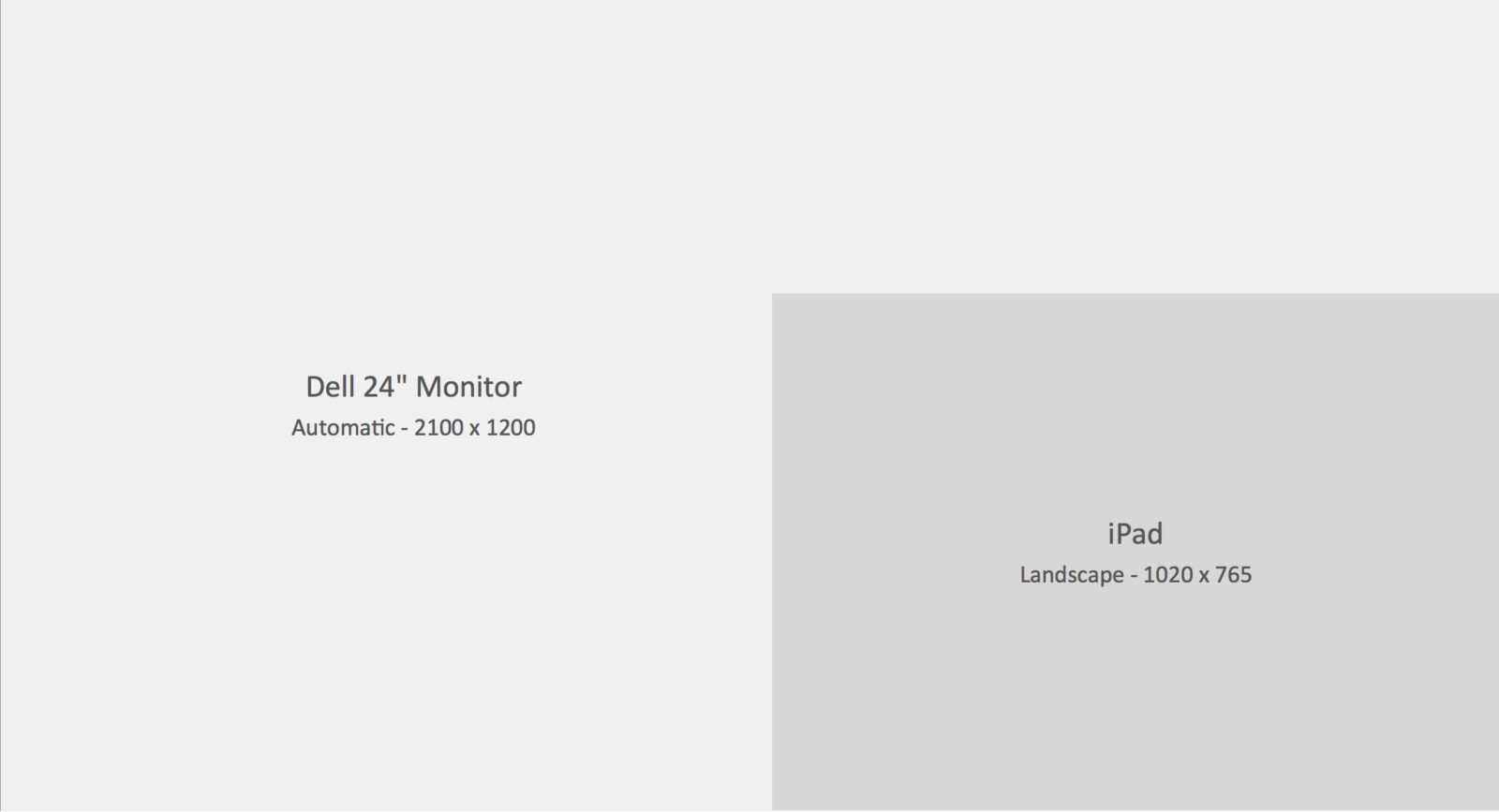
I still remember completing my first “real” dashboard in early 2012. I was so proud of it until I tried to show it off to a colleague using my laptop. I had originally created the dashboard using Tableau on my 24” Dell monitor with the dashboard size set to “automatic”. In doing this, I had unwittingly created a super-sized dashboard that looked terrible after it was squeezed down to fit inside my laptop’s much smaller screen.
As someone who has always considered design to be as important as finding the right mix of Key Performance Indicators (KPIs), I want my dashboards to be consistently rendered, and that includes minimizing the number of devices that need scroll bars to view the full dashboard. After researching the pros and cons of the “Range” size setting, a fixed set of dimensions seemed to be my only viable choice.
When it came time to pick the new dimensions, the decision was heavily influenced by my recently purchased iPad 2. Although tablet adoption by the business community was only starting to take off in 2012, it was easy to envision the tablet becoming a key method for business data consumption in the coming years. So I chose the iPad Landscape (1020 x 765) preset as the new default size.
From a prediction standpoint, if I was right, I would be future-proofing my existing work, as well as preparing for a time when tablet design requirements could become commonplace. On the other hand, if the prognostication turned out to be overly optimistic, I simply didn’t see any downside to learning how to build mobile-friendly dashboards.
With the new default chosen, the next step was to recreate my tabloid-sized dashboard inside the much smaller dimensions (see picture below). From the start, it was obvious I would not be able to keep all of the original content. The difference in canvas size was simply too great. I would have to decide what content to keep and what to discard as I rebuilt the dashboard.
Looking back now, I couldn’t have asked for a better start to my initial foray into dashboard building.
For most new dashboard builders, the initial mindset is not one of “how little” but “how much” data can be packed inside. Among new (and more than a few not-so-new) users, this “how much” mindset all too often manifests itself in an oversized dashboard crammed full of charts and text. With a larger canvas, it is easy for a screen full of empty space to become a distraction and cause one’s focus to shift from quality to quantity.
But the decision to use the iPad Landscape preset pushed me in the opposite direction. Working with a smaller canvas, I almost always find myself with a surplus of great content rather than a deficit. Having a surplus is always the preferred outcome. With a surplus you have to evaluate all of the content and then decide which mix provides the most value to the user. As you incorporate client feedback and develop more content, the evaluation process has to be repeated. If you want to add something new, something old has to be removed.
In order to make the right determination each time, you have to keep the dashboard’s goals front and center, think like a user and, when necessary, challenge a client’s assumptions.
If all of this sounds like Dashboard 101, it is. This approach, this mindset, should be part and parcel of every dashboard project regardless of canvas size. This is how you build an effective dashboard.
In practice, consistently following this approach is rarely easy. And it only becomes harder as you push the mix of content from good to great. It can become such a challenging exercise towards the end of the development process that it’s easy to lose sight of the intial fun and excitement of dashboard building.
Simply put, building a really effective dashboard isn’t all fun. It’s also hard.
By “hard”, I’m not necessarily referring to the extra effort needed to create a complex calculation or an awesome looking chart or graph. For a lot of dashboard builders, this kind of “hard” work is part of the fun – the fun of building something cool.
It’s “hard” in the sense of having to maintain a dispassionate mindset every time you evaluate the content mix and then having the wherewithal to discard that awesome-looking chart if you determine that a table, or even a single number, would convey the KPI in a faster, more effective manner.
And this is the crux of my smaller is better argument. With a larger canvas, the temptation is greater to save the cool chart that doesn’t add as much value. But all you have done is needlessly clutter your dashboard and turned the chart into a distraction. Every item on your canvas requires cognitive processing power from your users, and that is a limited resource. A smaller canvas should actually make it easier (but no less frustrating) to let go of that awesome chart since the replacement table (or number) would require less space and may make it possible to add something new to the dashboard. As you struggle to make everything fit, it is now easier for effectiveness to trump eye candy.
While it may be quicker to increase the canvas size and avoid difficult conversations with users by putting in every chart they request, everyone gains by having conversations about priorities, key metrics, and how users employ the information in your dashboard. When your users only have a limited amount of time and attention, every pixel counts. You want to create a dashboard that quickly communicates a clear message of what needs attention or requires action, which means it should be free of distractions.
As Antoine de Saint-Exupery said, “Perfection is achieved not when there is nothing more to add, but when there is nothing left to take away.”
If you’d like to learn more about how to improve your organization’s data visualization, join us May 17 for our Effective Communication through Data Visualization webinar. If you have other questions or would like to schedule a call, please contact us today.

