How many times have you struggled to find the happy medium between a report that looks phenomenal when printed, but has everything a user might need in an Excel export? I recently built a beautiful paginated report with groupings separated by white space for easy readability – but the user wanted to export the results to Excel, and the format prevented them from sorting or filtering the report contents. Power BI Report Builder has a couple features that can allow you the best of both worlds, with a few simple tricks. By the end of this tutorial, you will have created two Tablix, set up conditional visibility based on report render format, and set conditional sizing on the Excel Tablix (using hidden charts!) to prevent blank pages.
Part 1: Set up two Tablix
Your first Tablix will be the page view or PDF view. Your second Tablix will be the Excel export.
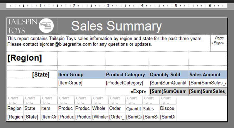
With the first table, I have three rows tied to the header grouping, one row for my details, and a final row for totals. The first row is for Region, which is my highest grouping. The second row is white space, because I want a visual separation between the States; the third row is my State grouping and headers combined. In the design view, this is what that looks like:
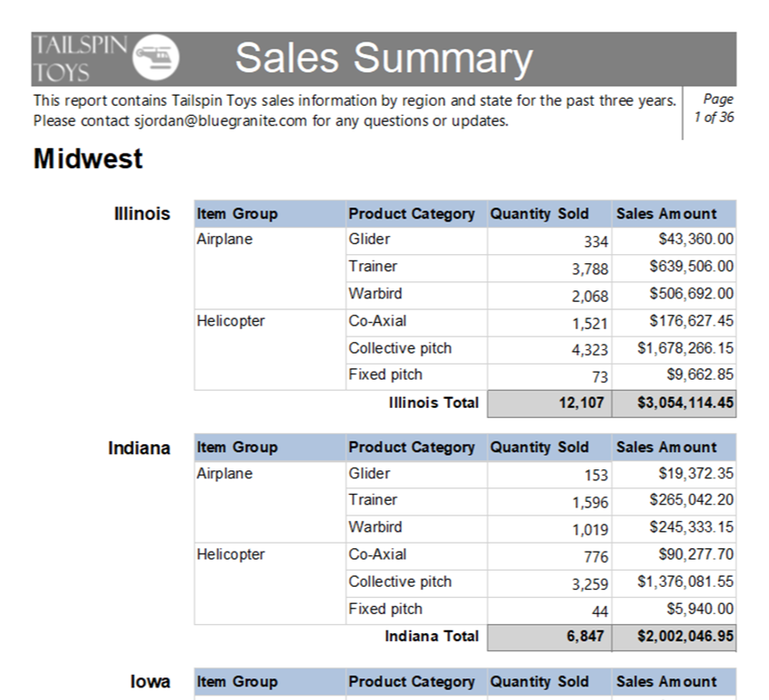
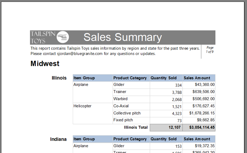
When I’m done, this is what the report page view looks like:
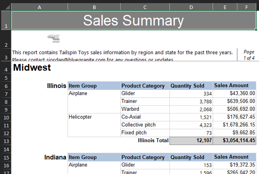
Looks great! But when I export the report, although it still looks pretty good, my report users really can’t sort or filter on the data. Region and State are in the same column, and my data headers are repeated for every state.
This is why I need a second version just for Excel. As such, my second Tablix is a very simple table with no groupings – the groups I have in the page view table are now just regular fields in the second table. My users also wanted a lot of additional data for drilling down, so this Tablix has several extra columns that are not present in the PDF/page view Tablix. I love this trick, because it’s a common situation – you want a version of a report you can print, but the users want so many extra columns, it won’t fit on one page! Usually, you end up smushing content or making the font really, really small, or your report is e x t r a w i d e and can’t be printed. This same concept can be used in that situation to have conditionally visible columns!
This is what the second table looks like: no frills, just data. Notice the new columns, Product, Wholesale Price, Order Count, and Discount Amount. I didn’t have room for that in my page view table originally, but my target audience won’t always need those details, so they agreed that having them in the export would be sufficient.
Now that we have our two tables, we need to set when each is visible.
Part 2: Set Up Conditional Visibility
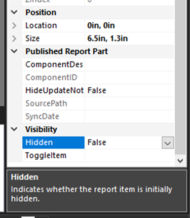
Power BI Report Builder has two features that are going to allow us to show or hide the tables based on how the report is being rendered to the user. First, it has expression-based visibility. On the Properties Pane, with your page view Tablix selected, you should see a visibility property almost at the very bottom.
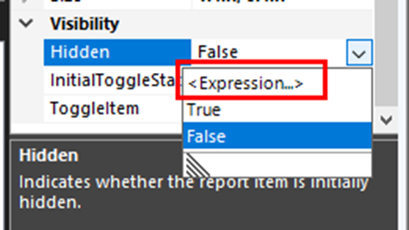
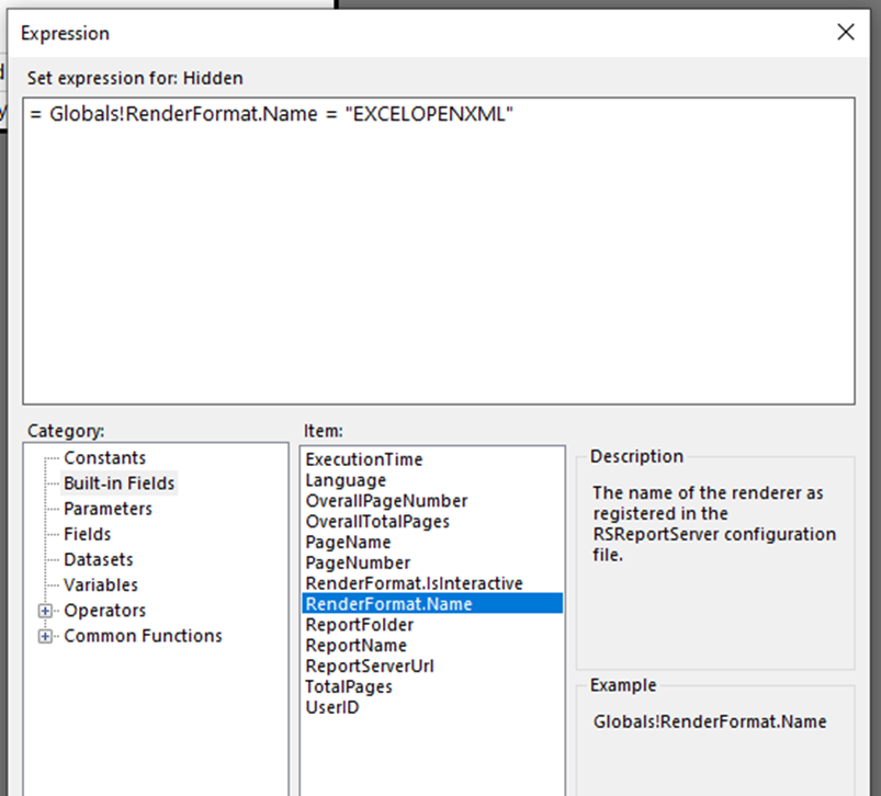
Choose Expression from the dropdown, and we will craft our expression based on when we want the tablix to be hidden. In this case, we want it to be hidden when we are exporting to Excel, which brings us to the second functionality Report Builder has – a built-in field that will populate with the report render format called RenderFormat.Name. You can find it under “Built-in Fields” in the expression builder.
As you can see in the above screen capture, our expression for hiding this table is as follows:
= Globals!RenderFormat.Name = “EXCELOPENXML”
Note: Depending on the version you have, your RSReportServer configuration file may call these formats by a different name. If “EXCELOPENXML” does not work, you can try “EXCEL”. If that still does not work, you might need to check your config file.
Repeat the same steps for the second table, the one we do want to show in Excel. Our expression for that will be:
= Globals!RenderFormat.Name <> “EXCELOPENXML”
In other words, if the report is rendering anywhere except Excel, this table should be hidden.
When you test this out, if your two tables were the same width and you don’t have any blank pages…. congratulations! You can skip Step 3, you’re done! But if you had to add columns like I did, and your design view looks something like this and every other page in the PDF is blank, stick with me…we’ll solve it!
Part 3: Set Up Conditional Sizing with Charts
Our problem now is that even though our Excel Tablix is hidden on page view, Report Builder sees those extra 3.5 inches of white space adjacent to the page view Tablix and adds the extra page to display it. I could make each column smaller, but unfortunately then my report users will have to expand the columns every time they export to Excel and want to view the data.
My solution to this issue is to add an extra row at the top and use an expression to expand the size when it renders in Excel; then I will shrink the columns in the design view so it’s no wider than my page view table.
Add an extra row just to your Excel view table, then click “Insert” and choose “Chart”. Click inside the first cell of your blank row and choose any of the charts offered. It doesn’t matter which one, I simply chose the first bar chart. It will look something like this when you are done:
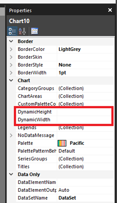
We are not adding any data to it, but placing the chart inside this cell opened up some new options on the Properties pane. These are the two we will be using, Dynamic Height and Dynamic Width.
First, set Dynamic Height to 0. When the report renders, this row will have a height of zero, so no one will be able to see our faux charts.
Next, we will set the Dynamic Width to an expression that will look a little familiar, since we used something like it for conditional visibility.
=IIf(Globals!RenderFormat.Name=”EXCELOPENXML”,”1in”,”.5in”)
In my case, I picked 1” wide columns when exported, but you should pick a size that fits your data well. You can make each one a custom size, but before we do any fiddling, let’s copy and paste our chart into all the blank cells in row 1. This also copies our dynamic sizing, so even if you want to tweak it later, this will save some typing.
Once the first row is filled with faux charts, you can start shrinking your column widths to fit. This is what mine looks like when I’m done setting them all to a half inch, which worked in my case.
When I run the report, the first good sign are my page counts. I’m down to 9 pages instead of 36 – the Excel version Tablix is not rendering on the report anymore, and I don’t have blank pages in between every page.
Tip: If you have a blank final page when running the report on the PBI Service, add a rectangle to your report body and drag both Tablix inside the rectangle, then put the rectangle back where your Tablix were. This keeps the second Tablix from making an extra page for itself.
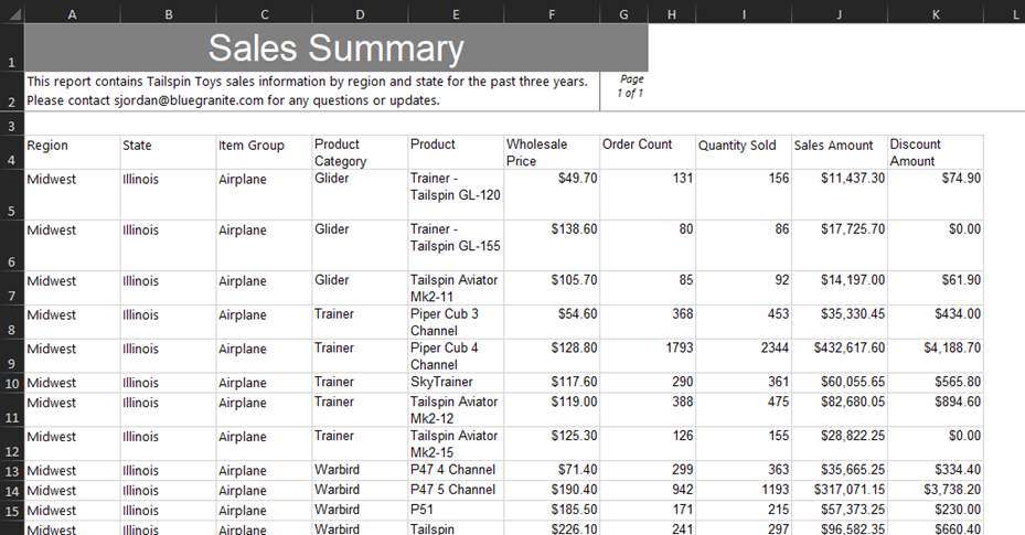
And this is the result of my Excel export:
Conclusion
Now my users have an export that can be sorted and filtered with minimal effort, and which contains columns with additional details they didn’t need in the main report but might be interested in digging into in the export. This is quick to set up once you know how, and I think it’s a nice way to have it both ways – beautiful, executive-ready PDF and detailed, explorable Excel for those users who want to have it all. BlueGranite has strong experience deploying a mix of both Power BI and paginated reporting in organizations of all sizes. If you’re wondering how paginated reports could better fit into your Power BI deployment, contact us today!
BlueGranite offers a variety of resources to help you learn how you can leverage Modern Data Analytics. We also offer free training events such as:
Please visit our website to learn more, or contact us directly to see how we can help you explore your about modern data analytics options and accelerate your business value.


