Call Center data is some of the most interesting, exciting, and difficult to visualize. We recently wanted to visualize call center agents’ statuses on a Gantt chart in Power BI so their managers could see the days and statuses side-by-side, rather than date-sequentially. This turned out to be stickier than anticipated! When internet searches failed us, my colleague came up with the perfect solution, and we wanted to share this for the next person in our shoes. All it takes is two lines of M code in Power Query!

About Gantt Charts
Gantt charts in Power BI are designed to show events over time, with both date and time on the x-axis and tasks or categories on the y-axis. Our challenge? We needed an x-axis based on time, with date as just another category on the y-axis.
But after trying every (Microsoft Certified) Gantt visual and timeline visual available in AppSource, we learned all options required datetime and either would not accept or visualize a time only x-axis. Unfortunately, using the actual datetime only visualized the statuses sequentially, which complicated the comparison of values between days.
After a subsequent, fruitless search for alternative solutions in forums and blog posts across the web, we asked our colleagues for help. The proposed solution was both simple and obvious in retrospect; ensure the date is always the same, and do not display it.
What does this look like when it’s working? We used Craydec Timelines from AppSource for our visual.
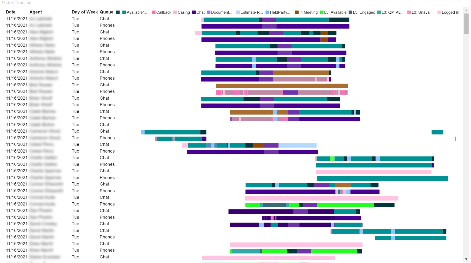
In this view, we can compare the agents side by side for the same day. We can also compare their statuses in each queue in which they can participate, chat or phones, to see if the statuses align or if someone forgot to change a status.
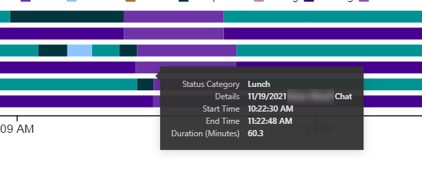
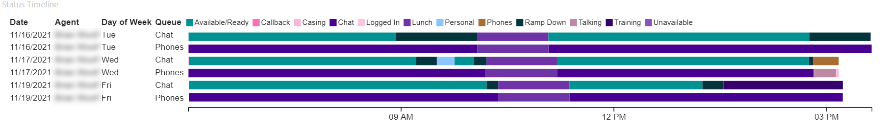 In this view, we are looking at a single agent for the week (or month, or longer) to see trends. While the color legend isn’t the most helpful due to the many status options available, tooltips can help us quickly identify what we are looking at.
So, how did we do it?
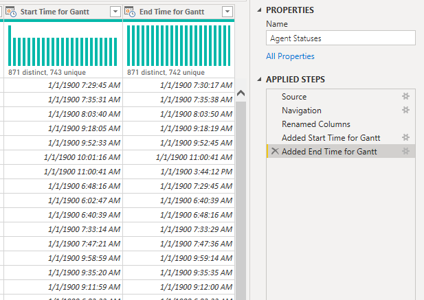
Our data has a status, start date and time, end date and time, and a duration in minutes. Per data modeling best practice, we had already split the date and time into separate columns. This is what our data looked like:
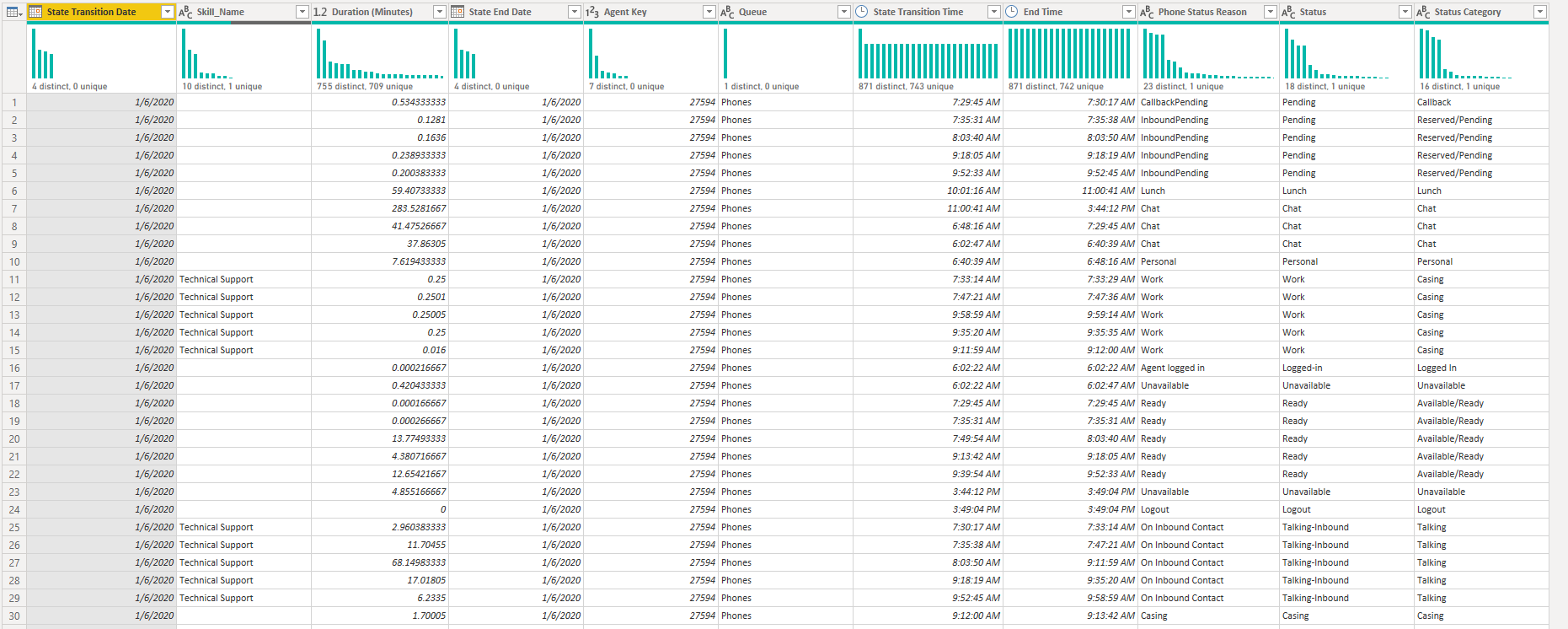
The trick our colleague proposed was to add a start time and end time column with a static date (1/1/1900) and dynamic time. This would not introduce the cardinality of a true datetime column to the model, since the date would not change, and it could be used in the Gantt charts or timeline visuals as-is. Here are screenshots of the columns we added, with code to follow.
![]()
![]()
Tip: We originally just tried DateTime.From, but were getting back 1899 dates which did not display on the visual.
Ensure you have Start Time and End Time columns without dates, and Start Date and End Date columns without times. Then you can enter the following M Code in the expression editor bar or Advanced Editor dialog box.
Table.AddColumn(#”Prior Step Name”, “Start Time for Gantt”, each Date.AddDays(DateTime.From([Start Time]),2), type datetime)
Repeat with the End Time.
With these two columns, we could display the agent statuses exactly as desired!
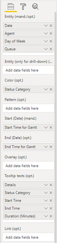
Here is how we set up the view with Craydec Timelines:
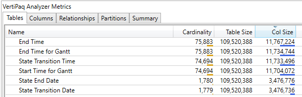
Then, we verified we did not add any extra cardinality to the model.
Once we had everything set up on the visual, we did need one line of DAX to create a sort field concatenation of the date, agent, and queue – this may not be necessary for your situation or chosen visual, but it was the final piece of our work.
![]()
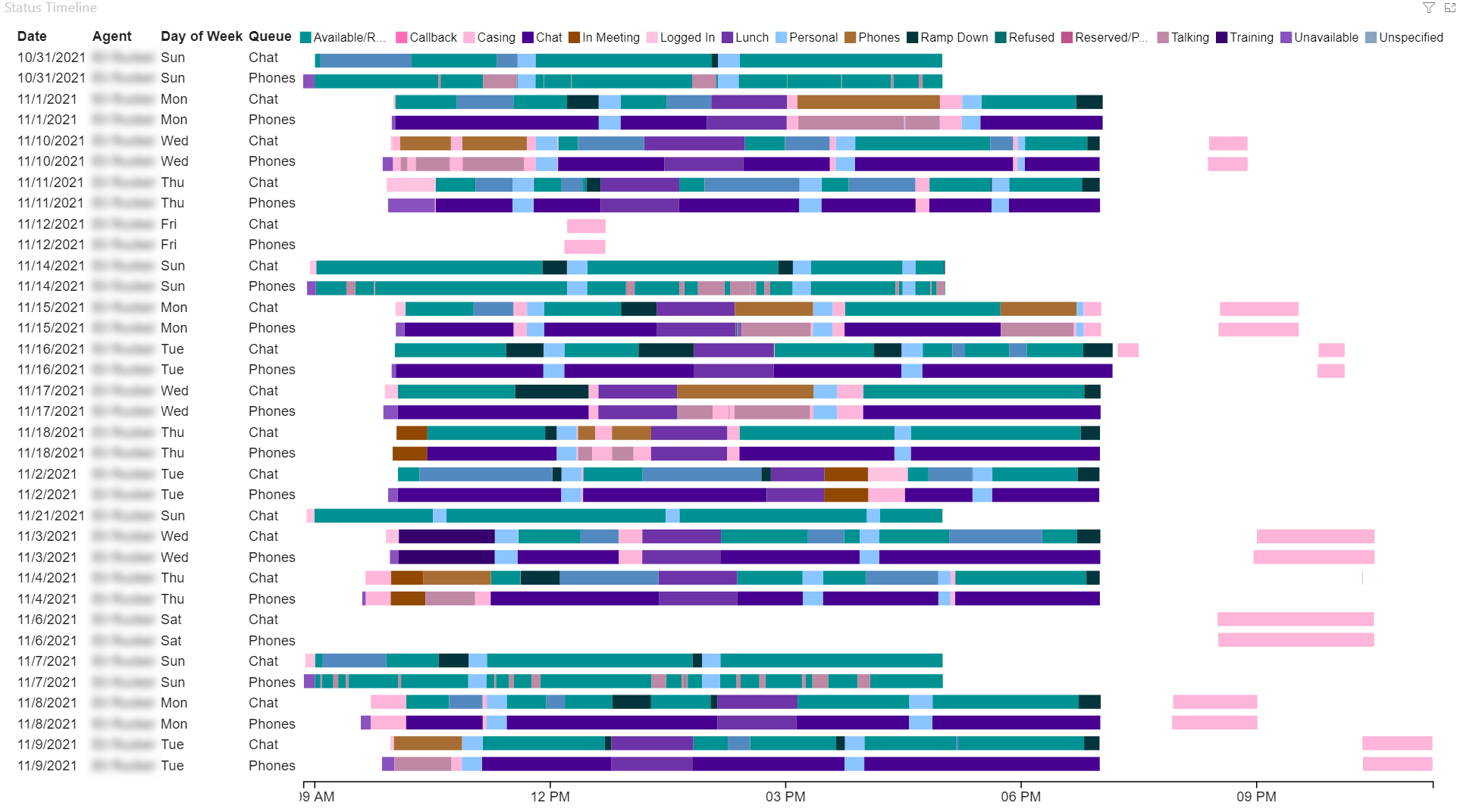
With that, the call center managers can explore statuses by day or day of the week, by queue, or by agent, to ensure statuses are being logged correctly, or to simply dive deeper into the day-to-day tasks taking up time in the call center. This is part of a much larger solution we delivered for our client to bring insight to call center agent activities and trends.
Conclusion
Please reach out to us today to find out more about how 3Cloud’s talented team can help you bring clarity and efficiency to your call center or other business endeavors today!
Please visit our website to learn more, or contact us directly to see how we can help you explore your about modern data analytics options and accelerate your business value.
About the Authors
 Sabrina Jordan
Sabrina is a Solution Consultant who spent nearly a decade working with data in specialty insurance. She has been designated as an Associate in Insurance Data Analytics through The Institutes Risk & Insurance Knowledge Group. She is passionate about stunning, efficient visualizations and focuses on transforming reporting by delivery of insights that organizations can take action on. She has experience with SQL, SSRS & Report Builder, ETL development, Power BI, and Python. She has a B.A. from Kalamazoo College, focusing on East Asia and International Business and Economics. Check her out on LinkedIn!
 Kate Blaylock
Kate is a Senior Consultant. Her experience includes designing, developing, and delivering collaborative end-to-end projects with particular emphasis on optimal data solutions, focused business intelligence deliverables, and interactive data visualizations. Kate specializes in solutions that empower leadership to leverage data as they guide companies, direct divisions, and manage departments. Kate enjoys working with many industries, including construction, real estate, hospitality, tourism, and retail. Check her out on LinkedIn!